daohaus
YEETER
Crowdfunding through a Moloch DAO, so supporters can leave with their share. How a team research sprint became Yeeter's interface, which I designed.
6 months · Co-founder & UX/UI Lead
Overview
Yeeter was a crowdfunding app built on Moloch DAOs. Each campaign summons its own DAO. Supporters "yeet" ether into its treasury and get loot in return, a share they can cash out by ragequitting: leaving with their proportional cut of whatever the treasury still holds. Our research called it an "unruggable" coin offering, one that makes it "difficult for either party (project teams or investors) to deceive one another."
In 2023 I co-founded Bootleggers, the three-person DAOhaus spinout that ran Yeeter v2. I led the product direction for v2 and designed its interface.
That interface turns each campaign into one circle. A campaign's progress, its supporters and the act of contributing share the same space, and every contribution reaches the team with a message attached.
My Role
I led the product direction and designed Yeeter's interface: the screens and flows, the ring system, the type, colour and voice. The research sprint was a team effort that I took part in. The contracts, the front-end build and the DAOhaus UI kit were my teammates' and DAOhaus's work, not mine. Version 2 shipped on that kit, across five chains; the screens on this page are the complete interface I designed for it.
The Problem: Trusting Strangers With Pooled Money
Yeeter was a response to the ICO boom of 2017. Projects raised money by selling tokens, then failed to deliver or misused the funds. The research overview adds the other side: supporters "lacked accountability over their investments," and could hurt a team by dumping its token. Rug pulls went both ways.
Moloch's contracts offered a different deal. The money sits in a shared treasury. Spending it takes a proposal that members vote on. Anyone holding shares or loot can ragequit. That protection has limits: a supporter leaves with a share of what remains, not of what was already spent. "Unruggable" meant difficult to deceive, not impossible.
That was Moloch's mechanism, not ours. Our question was what crowdfunding should look and feel like when that is the deal, for teams raising money and for the people backing them. The research report's comparison set was GoFundMe, Kickstarter and Patreon, and in web3 Juicebox and PartyDAO.
The Team Sprint, August 2023
In August 2023 the three of us met in person for a week-long design sprint on the state of Yeeter. It produced two public documents: the Yeeter v2 UX research report and a prioritised v2 backlog. The report runs from a competitive analysis and personas through user stories, flows and screen descriptions to an interview script and a survey. Bootleggers' funding proposal to PublicHaus cited both, with ETHDenver in February 2024 as the deadline.
The user stories are where the interface starts. The stories for teams and supporters alike ask to see a campaign's goal and current status, the time left, the number of supporters, and what other people were saying about it. One supporter story asks to "add comments or feedback when I contribute so that I can communicate my support or concerns to the project team."
In September I wrote up where I thought the brief should go. My notes argued that exchanging tokens for shares, though "the key mechanical feature," was "the lowest priority social feature." What mattered more was accountability between a team and its supporters, the visibility of a community's health "beyond the purely economic," and what I called survivability: whether that relationship could live, mature and end well. That became the brief I designed to: put the people and the progress in front, and keep the transaction inside them.
The Interface: Every Campaign a Circle
Yeeter's interface drops the usual container: there is no header, no navigation bar, no footer and no grid of cards. A campaign is a single circular object, the project's artwork inside two progress rings, with everything about the project gathered on and around it and its main actions in round buttons on its rim.
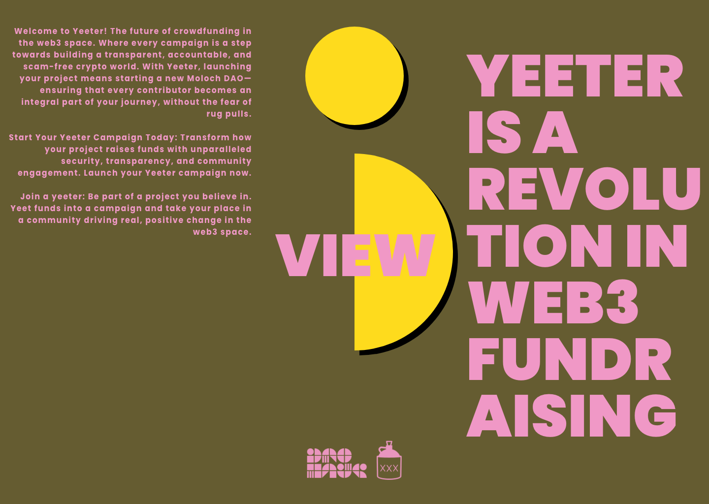
The landing page is one sun. Hovering it splits it into NEW, for teams starting a campaign, and VIEW, for supporters looking for one. Hovering the headline turns it into WHAT THE ACTUAL FUCK?, and clicking it opens a page that explains what a yeeter is. The campaigns, supporters and amounts on these screens are placeholders.
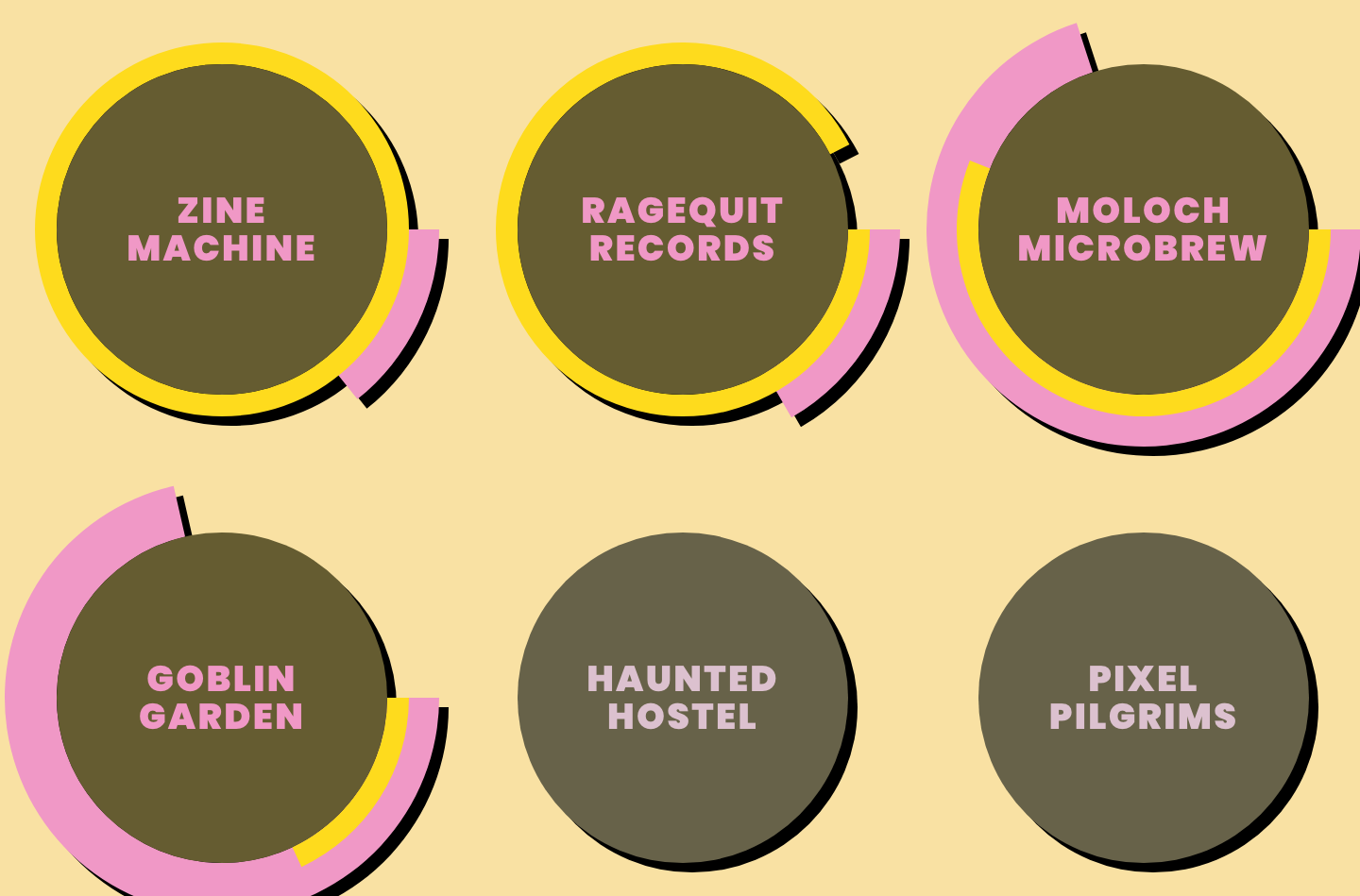
VIEW opens the campaigns as a field of rings that scrolls in every direction. Pink is the time left and yellow the money raised, so every campaign shows its state in the same two colours, and the campaigns that aren't live are greyed out. Two rings on one mark carry the clock and the money together, both things the user stories asked to see.
Up Close: The Yeet Happens in Place
The research left one question open. Its overview of the screens asks, in bold, "Would the project details and Yeet be in the same view?", and expects the yeet itself to be "a form, possibly in a modal format." The user stories wanted a contribution to come with a message the team would see.
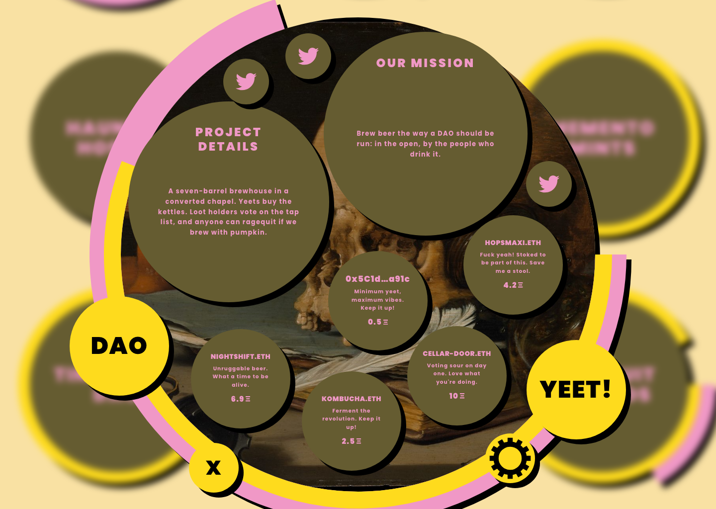
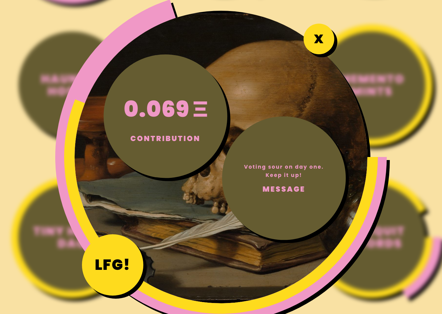
My answer was the same view. A campaign is one platform. The project details, the mission and the team's links sit on it as bubbles, and so does every supporter's yeet, each with a name, a message and an amount. Contributions stay in view alongside the project, and the team can see the community it answers to. The actions sit on the rim as round buttons: DAO, YEET!, which counts down the time left, a close button, and a gear for editing the campaign's details.
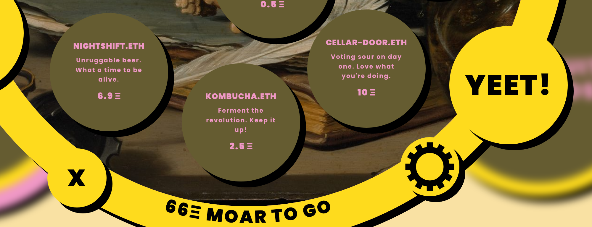
The two rings carry the campaign's state, and the numbers appear on the arc only when a supporter asks for them. Hovering the yellow ring writes what is left to raise along it; hovering the pink ring writes the days left to yeet. The platform stays a picture of the campaign until someone wants the figures.
Our research pictured a contribution modal. I made the platform the form instead: pressing YEET! turns it into one bubble for the contribution and one for a message, and LFG! lights only when both are filled. Money and words travel together, so every contribution reaches the team with something to say.
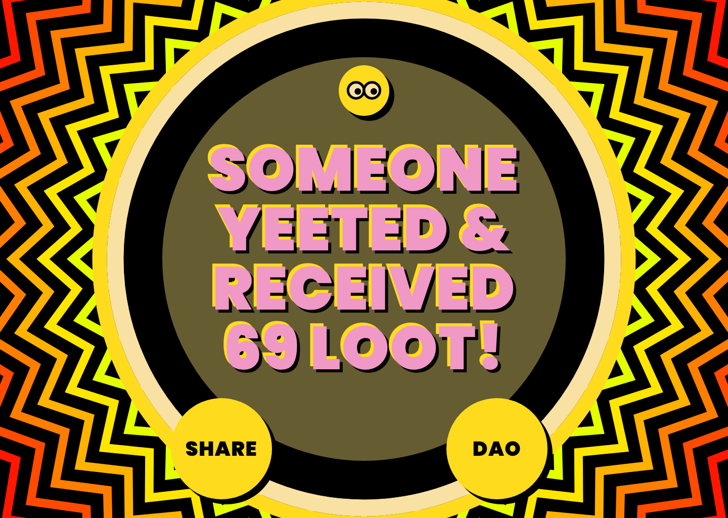
A yeet ends on a full-screen burst that tells the supporter what they received.
The Rest of the Flow
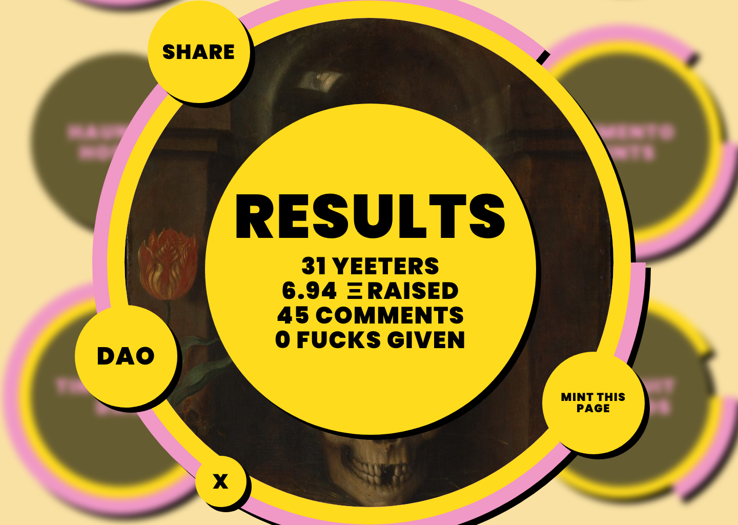
Before launch, a single cream countdown ring replaces the two. After the end, YEET! becomes YEET OVER, and RESULTS counts the yeeters, the ether raised and the comments, plus "0 FUCKS GIVEN," with SHARE, DAO and MINT THIS PAGE around it.
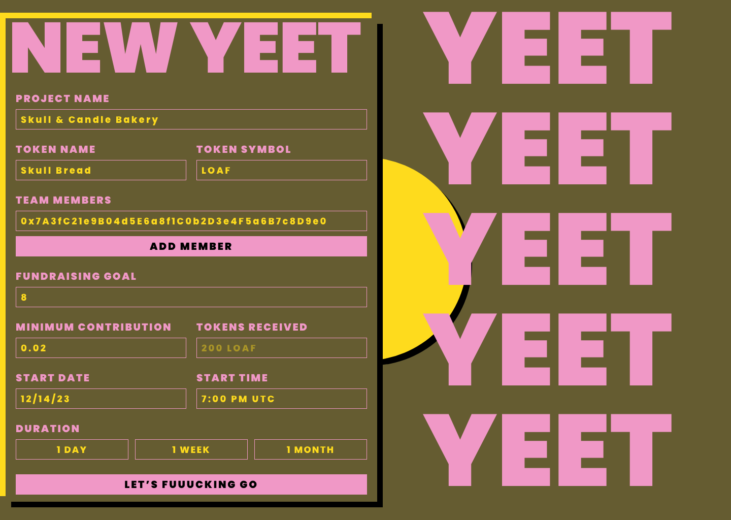
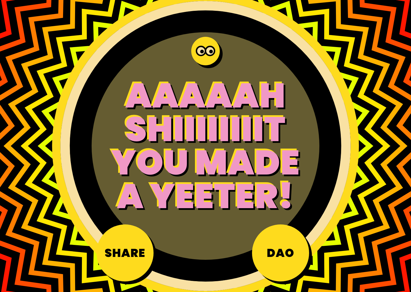
NEW opens the form for teams. The research pictured a step-by-step form; I put every field on one page, over a wall of YEETs: the project name, token name and token symbol; the team; the goal, the minimum contribution and the tokens received; the start and the duration. The early wireframes asked whether a project, its DAO and its token should share one name; this form asks for the project name, token name and token symbol separately. It ends in "LET'S FUUUCKING GO," and the answer is "AAAAAH SHIIIIIIIIT YOU MADE A YEETER!" The new campaign then waits on its countdown, with question marks where its story will go.
Three More Decisions
- A profile the team fills in. A new campaign's details and mission start as question marks the team clicks to fill, and its social links start as ADD. The empty state is an invitation, not an error.
- Voice as design. The copy is deliberately loud and profane. With the olive, pink and yellow palette and Poppins Black, up to a 200 pt Huge Title style, it says this is a tool for communities that fund each other, not a fintech dashboard. Even SHARE stays in voice: it offers XXXITTER, WARTCAST, FARTCASTER and LAMESTER.
- One palette, four states. Olive, pink, yellow and cream each come in default, hover, enabled and disabled tones, so every ring and button changes state the same way.
What Sat Underneath
Underneath, a campaign is a Moloch v3 DAO with the Yeeter shaman, a contract that runs the campaign's timing, goal and minimum contribution and issues its loot.
The interface doesn't put ragequit on the campaign. The DAO button on the rim leads to the campaign's DAO, where members propose, vote and leave. The campaign itself shows what the user stories asked for: the progress, the time left and the other supporters.
The research also went further than v2. Its screen overview gives a campaign's dashboard milestones and rewards, and gives the end of a campaign three outcomes: life, death and reincarnation. My notes pushed the death outcome further, arguing that a DAO should be allowed to die, with a ceremony to mark it. None of that was built, and a campaign's end is its Results screen.
What We Didn't Measure
We had little tracking in place after v2 launched, and we did not systematically measure:
- how many projects launched across the five chains;
- how often campaigns reached their goals;
- whether teams and supporters came back;
- how Yeeter's adoption compared with other platforms'.
So this study makes no claim about adoption or outcomes. What it shows is the research and the interface that came out of it.
What I Learned
A guarantee people can't see does little for trust. Moloch's contracts made a fair exit possible. Making the relationship between a team and its supporters visible was the interface's job, and that is the part I designed.
Lead with the relationship, not the mechanism. Exchanging ether for loot is what made Yeeter work, and as a social feature it mattered least. Starting from the team and its supporters is what put the yeet on the campaign itself, among the people it joins.